

Simple, iconic, unforgettable…we’re counting down ten of the most memorable and effective horror movie posters of all time
Movie posters are an important form of marketing; they have to sell the movie without action or dialogue, and they shouldn’t give away any spoilers. Most movies even have more than one billboard, sign, or advertisement. Posters for films in a number of genres are known for being memorable, well-designed and clever, and horror movies are no exception.
Several horror movie posters didn’t make this list for a variety of reasons. There are classics, like The Exorcist and its tension, or Halloween, with the seasonal pumpkin and the knife kicking off a generation of slasher films. There are some newer movies, like the horror-comedy The Visit, which has a poster mimicking cross-stitch and nostalgia, but twisting your expectations enough to pique your interest. That being said, here are the ten films that did make the list with one of their promotional movie posters, in no particular order.
The Descent (2005)
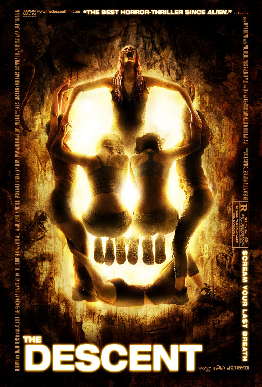
From afar, the poster for 2005’s spelunking film looks like an odd glowing skull, but it soon becomes apparent that it’s only the form of a skull made up of six women. In addition, the only woman whose face you can actually see appears to be screaming in agony. The poster sticks to the plot and theme of the movie, which is about women exploring a cave, but also lets the viewer know that pain and death are ahead. It’s an almost perfect film poster: aesthetically pleasing and portraying the film’s tone successfully.
Jaws (1975)

This is one of the only posters considered a classic to make the list. As with many older films, the poster for Jaws was trying to sell “The terrifying motion picture from the terrifying No. 1 best seller,” using words as well as imagery to get an audience. However, the advertisement’s picture would sell the movie just as well by itself. The unaware woman swimming in the ocean and the gigantic creature sneaking up below her creates a tension that is rarely seen in an image alone.
April Fool’s Day (1986)
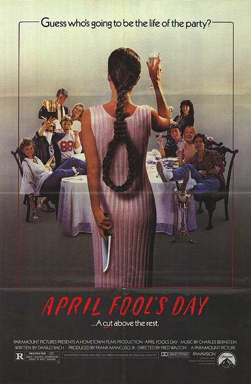
This is a poster that is clearly a product of its time and likely one of the best 1980s slasher film posters. Unlike simpler posters like those for Prom Night and My Bloody Valentine – which are still not awful – this one gives us the knife that indicates a slasher, but so much more. We get to see the rowdy gang that we’re going to meet at the beginning of the film, and watch disappear throughout, but the real treat here is the host’s braid, which has been crafted into a noose. This makes something that could be innocent into something dangerous, much like an April Fool’s Day prank.
V/H/S (2012)

Much like The Descent, the V/H/S poster indicates its place in the horror genre with skull imagery. This time, though, the shape is made of – what else? – VHS tapes. It’s simple but effective, and the second film in the franchise follows suit using the film within the tapes. V/H/S is an anthology which makes it harder to represent, but the wraparound story is focused on watching old VHS tapes, making this a fitting advertisement.
The Burning (1981)
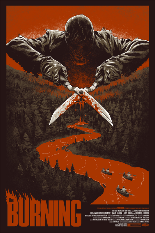
Another 1980s slasher film to make the list, The Burning uses a different weapon than most: rather than a knife, this one features a pair of hedge clippers. Much like the better-known Friday the 13th franchise, The Burning is about revenge on teenagers at a summer camp. On the film’s poster, we see a masked figure using the hedge clippers, which are dripping with blood, but the blood is forming a river on which viewers will notice small canoes in the foreground. It’s a clever use of scale and depth while not being too flashy or kitsch.
We Are Still Here (2015)
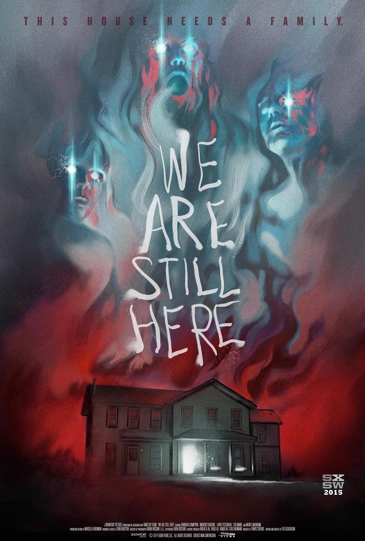
This is one of the most recent film posters to appear on the list, but the vibe of it is fairly retro. What else might one expect from a modern horror film featuring an actress with a horror movie pedigree like Barbara Crampton? We Are Still Here is a supernatural film that strongly features both spirits and fire – both of which are front and center, yet still subtle, on the poster. In addition, both the movie and the poster center on an unremarkable suburban home, except for those entities which surround and engulf it.
Peeping Tom (1960)
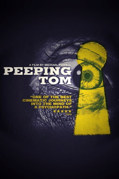
Movies in the 1950s and 1960s often had posters featuring famous names and faces, and rarely told their potential audiences what their film was about – that’s one reason no Hitchcock posters made this list. One of the posters for Peeping Tom, however, portrayed tone and ignored star power. An enlarged eye is unsettling enough, but one peering through a keyhole digs into anxieties most people have; even if it weren’t a keyhole, almost anyone would be unsettled to see an eye in their door’s peephole or know that someone was watching them through a camera on an electronic device. The advertisement doesn’t spare you from the discomfort the film’s victims experience and it saves you from the outright gore.
The Silence of the Lambs (1991)
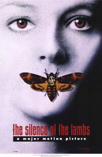
Another poster that is brought up with regularity, The Silence of the Lambs may have even been an inspiration to others on this list. While it does feature star Jodie Foster’s face prominently, the standout factor is in the moth covering her mouth. Again, it might be something otherwise harmless, but with a closer look we see the skull imagery. This film is one of the only modern horror movies (arguably) to win an Academy Award, and the subtlety used in this poster is a hint as to why that may be – it’s ultimately about a cannibal, with no gore in sight.
As Above, So Below (2014)
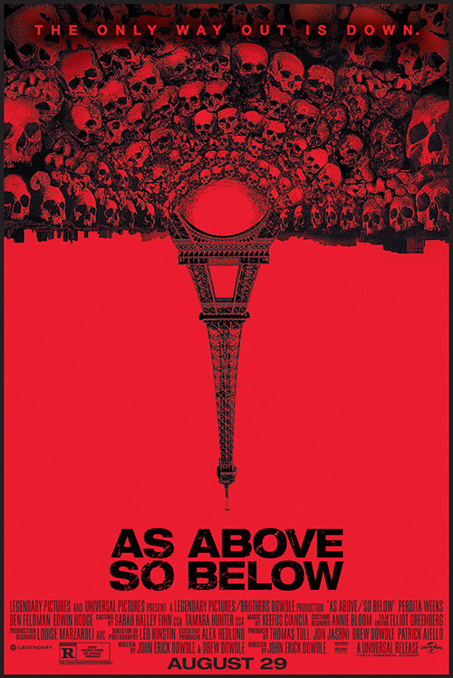
The poster for As Above, So Below portrays a lot with only two colors. It makes you think about what you’re looking at, because the grayscale images set against the eye-catching red background do portray Paris – and most notably the Eiffel Tower – but it’s all turned upside down. The only thing appearing to be the right way around is the skulls at the base of the city, which represent the catacombs, the French city’s darker tourist destination, where most of the film takes place. The featured tagline is equally confusing: “The only way out is down.” The only way to find out what any of it means is to watch the movie.
Devil (2010)

This is one of the simpler concepts for a film poster on the list, and it does portray a more straightforward horror vibe than the murder mystery that Devil delivers, but it uses the space well. Most of the movie’s action does take place in an elevator (other ad campaigns for the film even used an elevator “Down” button lit up as the “v” in the film’s title). Additionally, the reddish light coming from the slightly ajar elevator doors pictured form an upside down cross, horror’s go-to imagery for anything Satanic. It’s a fairly subtle move for a low-key movie, and it’s effective.


Follow Us!