


Horror cinema wields a vibrant palette of color to amplify fear, from the visceral reds of bloodshed to the eerie blues of the supernatural.

EDITOR’S NOTE: This article was originally published on April 9, 2025, and has been republished with updates.
No time to read? Click the button below to listen to this post.
There’s something deeply unsettling about the wrong color in the wrong place. In horror films, color is rarely accidental. It’s used to unsettle, signal danger, or create a lingering sense of unease. Directors and cinematographers have long understood that what we see—and how we perceive it— affects how we feel. The icy blues of The Ring, the sterile whites of Get Out, or the blood-drenched reds of Suspiria all evoke distinct psychological reactions.
Color becomes more than background; it becomes an emotional trigger. For example, red is rarely just red in a horror movie. It’s often blood, danger, or something more symbolic: raw emotion, perhaps, or the threat that’s just about to become real. Green, especially in sickly or neon shades, evokes associations with poison, decay, or the unnatural.
These same associations creep beyond cinema. Take a look at Hexabet Casino https://hexa-betcasino.com/, for instance; the site’s carefully chosen visuals echo that same emotional logic. Bold contrasts and intense hues are used not only for aesthetic purposes but also to heighten tension, sharpen focus, and energize decision-making. It’s not horror, but it plays with the same instincts.
Why Red Haunts and Green Disturbs: The Psychology Behind Horror Color Choices
In the realm of horror, where shadows dance and darkness reigns, it’s easy to assume that fear is solely born from the absence of light. Yet, beneath the cloak of night, a vibrant and often unsettling palette of colors plays a crucial role in painting our nightmares. From the crimson spray of a slasher flick to the eerie blue glow of a haunted encounter, color in horror cinema is far more than just a visual detail; it’s a powerful tool that filmmakers wield to manipulate our emotions, foreshadow terror, and delve into the deepest recesses of the human psyche.
Red: The Visceral Stain of Terror
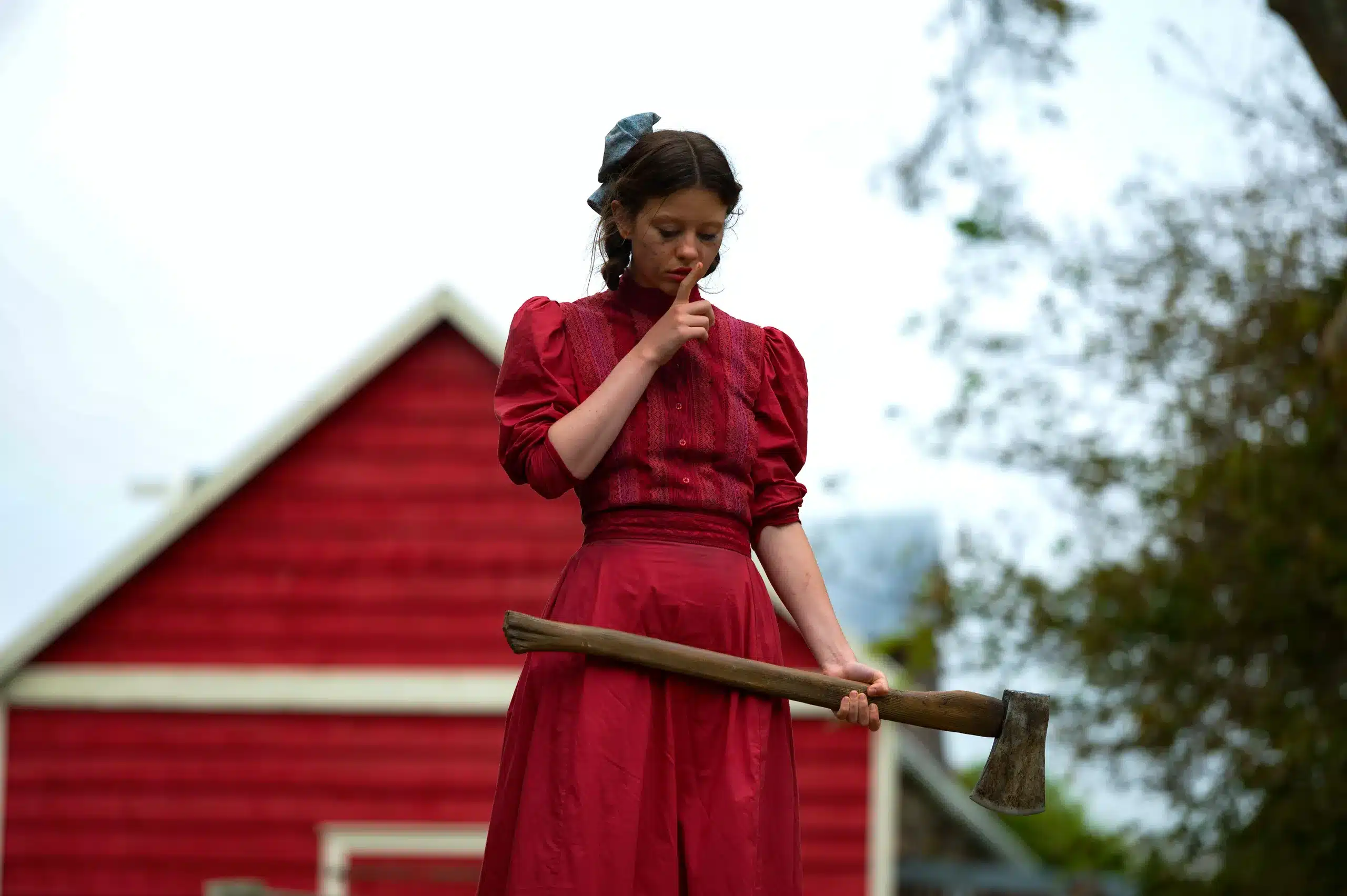
Perhaps the most immediately recognizable color in horror, red is inextricably linked with blood, violence, and the raw, visceral nature of fear. Whether it’s the geyser of crimson erupting in Brian De Palma’s Carrie, the ominously scrawled “redrum” in Stanley Kubrick’s The Shining, or the lavishly applied arterial spray in countless slasher films, red serves as a potent reminder of our mortality and the potential for brutal physicality.
In the lurid worlds of Dario Argento’s giallo films, like Suspiria, red becomes almost theatrical, an operatic splash of terror that transcends realism and plunges us into a heightened state of anxiety. But red can also symbolize a twisted passion or a dangerous obsession, adding layers of psychological unease to the bloodshed.
Blue: The Chill of the Unknown
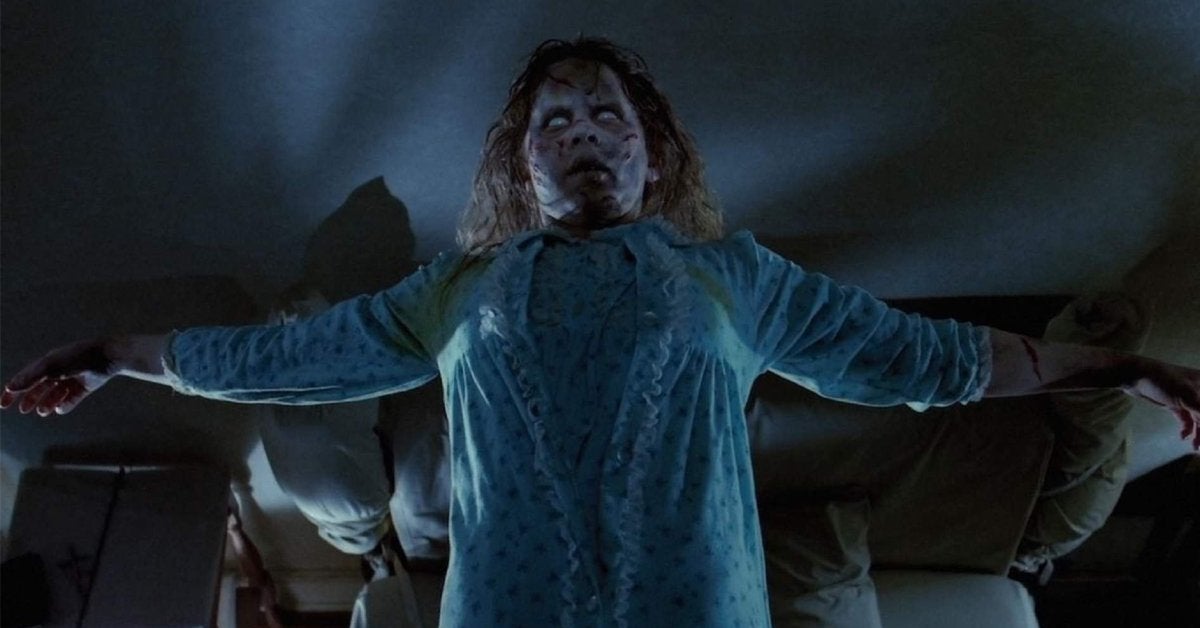
In stark contrast to red’s fiery intensity, blue often signifies coldness, isolation, and the spectral realm. The eerie blue lighting that permeates William Friedkin’s The Exorcist contributes to the film’s unsettling atmosphere of demonic presence and spiritual dread. The sterile, often desaturated blues found in psychological thrillers like Jonathan Demme’s The Silence of the Lambs can evoke a sense of clinical detachment and underlying menace.
And when films delve into the supernatural, ghostly apparitions are frequently bathed in a chilling blue hue, emphasizing their otherworldly nature and the unsettling boundary between the living and the dead. Blue can also represent a profound sadness or a sense of being lost in the vast unknown, amplifying feelings of vulnerability and existential dread.
Green: The Unnatural Bloom of Decay
Often associated with nature and life, green takes on a sinister connotation in horror, frequently representing decay, sickness, and the unnatural. The sickly green glow emanating from toxic waste in films like Return of the Living Dead immediately signals danger and the grotesque. David Cronenberg’s The Fly utilizes a queasy green palette to underscore the protagonist’s horrifying transformation and the organic corruption taking hold.
Even in folk horror like Robert Eggers’ The Witch, the unsettling green of the surrounding wilderness can feel ominous and foreboding, hinting at ancient evils lurking within the natural world. Green in horror often evokes a sense of revulsion and unease, suggesting something fundamentally wrong or tainted.
Yellow/Gold: A Glimmer of Danger

While often associated with warmth and sunlight, yellow and gold in horror can take on a more insidious meaning. Flickering yellow lights in a dilapidated setting often serve as a visual warning, foreshadowing impending danger. A jaundiced yellow hue can suggest illness, mental instability, or a sense of decay that is more subtle but equally unsettling. Sometimes, a deceptive golden light can even create a false sense of security before the darkness descends, making the eventual horror all the more jarring.
The artificiality often associated with certain shades of yellow can also contribute to a feeling of unease, suggesting something is not quite right beneath the surface.
Purple: The Surreal Veil of the Uncanny
Stepping away from more grounded associations, purple often ventures into the realm of the surreal, the mystical, and the otherworldly. In the vibrant and often dreamlike world of giallo cinema, purple can be a key element in creating a sense of disorientation and unease, blurring the lines between reality and nightmare. Films like Panos Cosmatos’ Beyond the Black Rainbow bathe their visuals in intense purple hues, contributing to the film’s psychedelic and unsettling atmosphere.
Purple can also suggest a sense of decadent corruption or a descent into madness, adding a layer of psychological complexity to the horror.
Black and White: The Timeless Terror of Absence
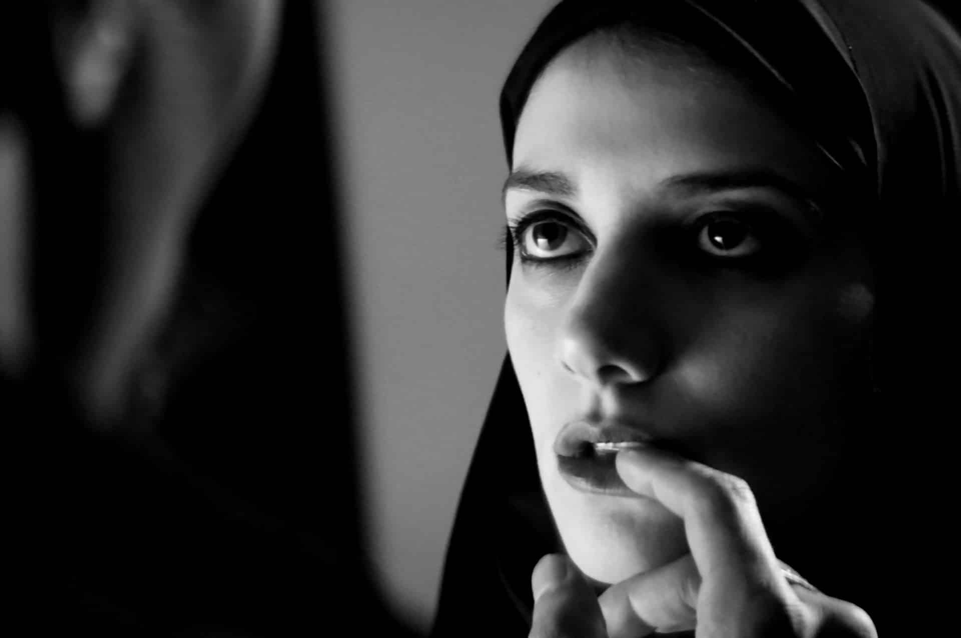
While the absence of color might seem like a straightforward choice, black and white cinematography in horror can be incredibly effective; it strips away the vibrancy of the world, heightening the impact of shadows and creating a stark, unsettling atmosphere. Classic films like F.W. Murnau’s Nosferatu and Alfred Hitchcock’s Psycho utilize black and white to create a sense of timeless dread and emphasize the stark contrasts between light and shadow, good and evil.
More recently, Robert Eggers’ The Lighthouse masterfully employs black and white to evoke a sense of claustrophobia, isolation, and a descent into primal madness, proving that sometimes, what’s missing can be just as terrifying as what’s present.
Case Studies: Masters of Color in Horror
The true artistry of color in horror lies in its deliberate and impactful application. Here are a few films that stand out for their masterful use of color.
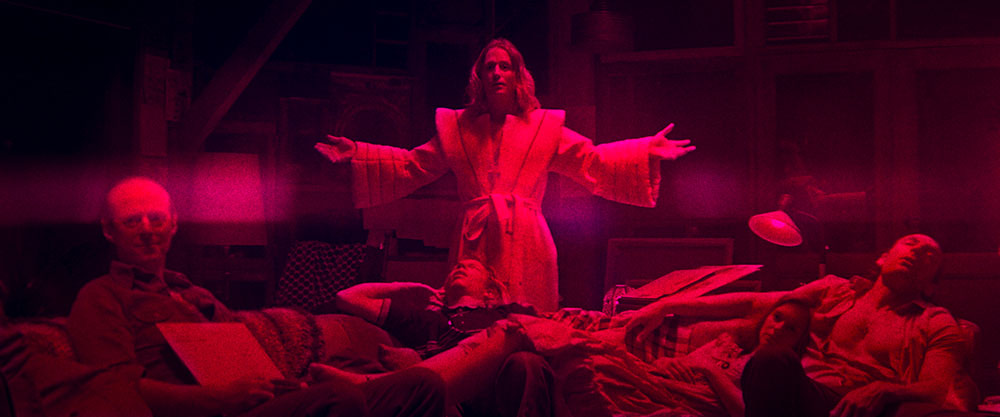
Dario Argento’s Suspiria (1977)
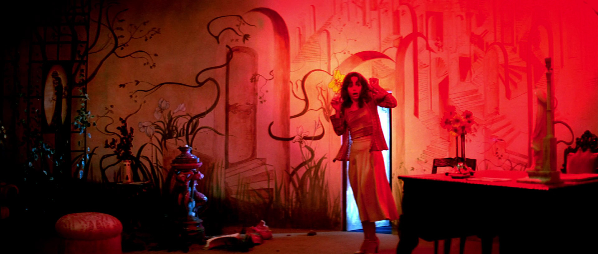
Argento’s masterpiece is a sensory assault of vibrant, almost aggressively saturated colors. The film’s ballet school setting becomes a nightmarish canvas painted with intense reds, electric blues, and sickly greens. These colors aren’t meant to be realistic; they are designed to evoke a visceral, dreamlike state, mirroring the protagonist’s descent into a world of witchcraft and terror. The bold color choices amplify the film’s operatic violence and contribute to its enduringly unsettling atmosphere, making it a landmark example of stylized horror.
Nicolas Winding Refn’s Neon Demon (2016)
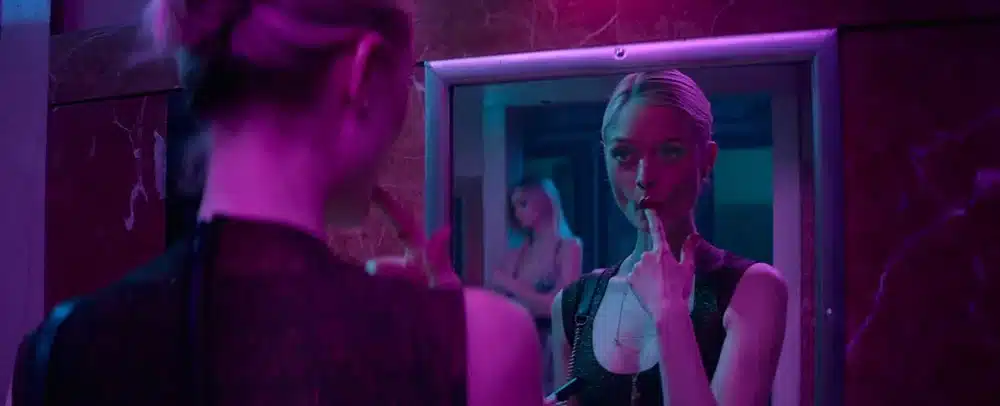
While perhaps leaning more towards thriller with horror elements, Neon Demon offers a striking example of how neon colors can be used to create a visually arresting and deeply unsettling experience. The film bathes its Los Angeles fashion world in pulsating pinks, icy blues, and seductive purples. These vibrant hues initially appear glamorous but gradually take on a more sinister connotation, reflecting the predatory nature of the industry and the protagonist’s increasingly distorted perception of beauty and desire. The film demonstrates how even seemingly beautiful colors can become deeply unsettling in the right context.
Robert Eggers’ The Lighthouse (2019)
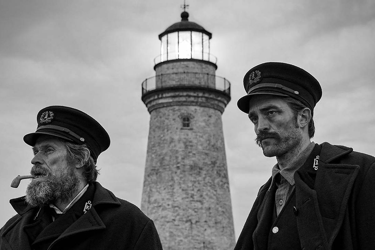
In stark contrast to the vibrant palettes above, The Lighthouse‘s commitment to black and white is a crucial element of its horror. The lack of color emphasizes the stark isolation of the two lighthouse keepers and the increasingly blurred lines between reality and madness. The deep shadows and stark contrasts create a claustrophobic and oppressive atmosphere, mirroring the psychological deterioration of the characters. The monochrome palette lends the film a timeless, almost mythical quality, enhancing the sense of ancient dread and the power of the elements.
Jordan Peele’s Us (2019)
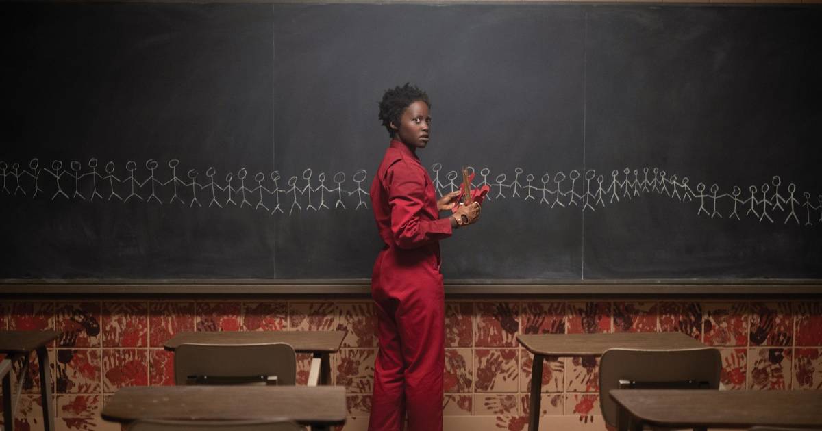
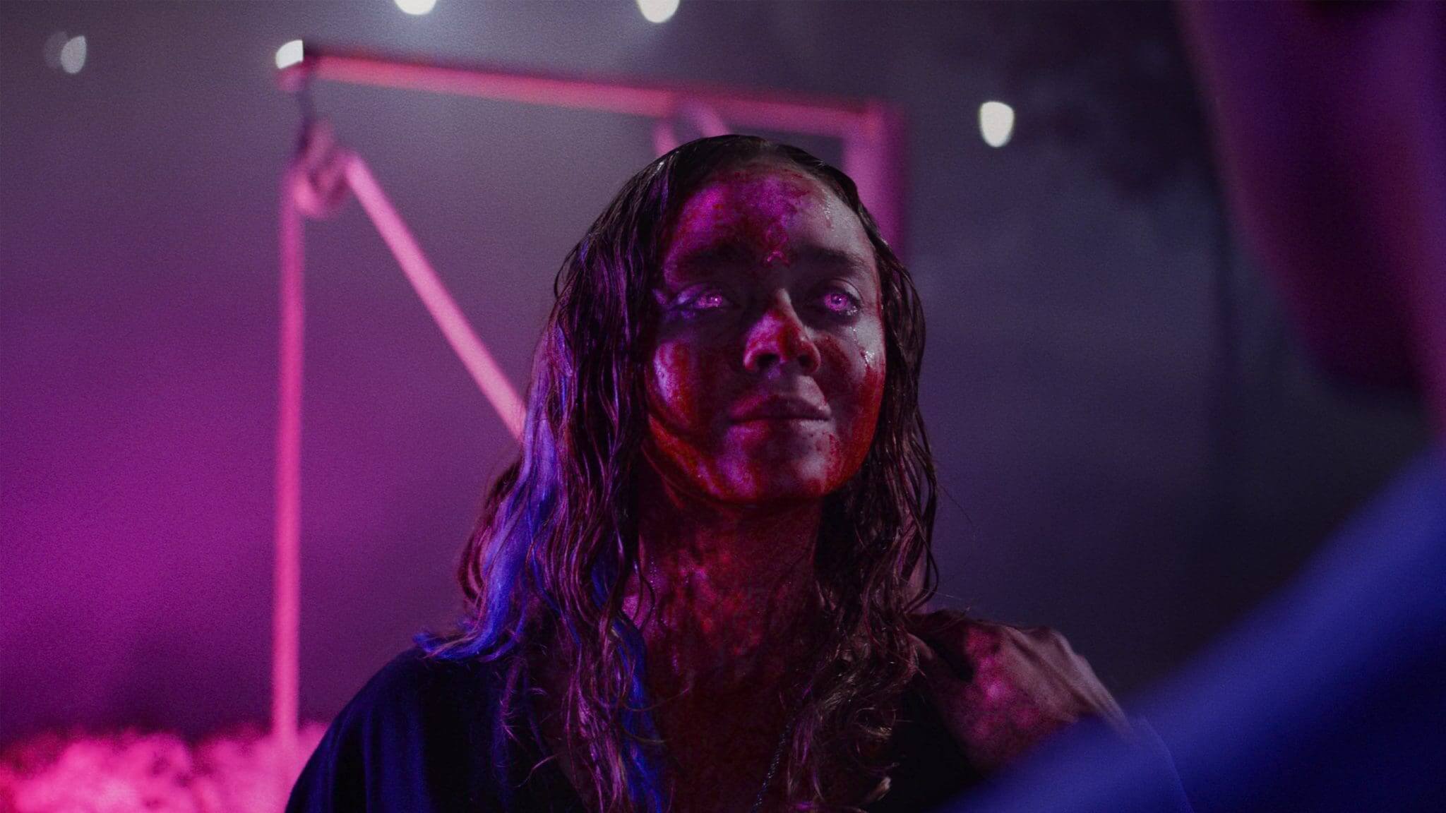
Peele’s chilling exploration of duality and societal anxieties makes brilliant use of the color red. The striking red jumpsuits worn by the Tethered are an instantly iconic and deeply unsettling visual. This bold choice immediately signifies danger, otherness, and a distorted reflection of the surface world. The pervasive use of red in their underground tunnels and during their violent uprising reinforces the themes of primal urges and the bloody consequences of societal neglect. The simplicity and impact of the red against the often muted tones of the surface world make it a powerful visual motif throughout the film.
Beyond Symbolism: Color as Atmosphere and Psychological Tool
Beyond their direct symbolic meanings, colors in horror films play a significant role in shaping the overall atmosphere and psychological impact. A desaturated color palette, for instance, can create a sense of realism and grit, making the horror feel more grounded and disturbing. Consider the muted tones in many found-footage horror films, which contribute to their unsettling sense of realism.
Conversely, a film might utilize a limited color palette to create a feeling of claustrophobia or obsession, focusing the viewer’s attention on specific elements and enhancing the sense of unease. The strategic use of contrasting colors can also generate visual tension and unease, creating a sense of disharmony that mirrors the narrative’s unsettling themes.
Directors use shifts in color to guide emotional responses, sometimes without the viewer even realizing it. Shadows deepen, colors wash out, or an unnatural glow sets in… and suddenly, the world feels off.
Pairing the emotional impact of color schemes with a good drink can deepen the sensory experience. Discover quality wines at gaia-wines.gr to complement the mood created by horror-themed color palettes.
Conclusion
From the visceral reds of bloodshed to the chilling blues of the spectral realm, color in horror cinema is a language spoken in hues, a subtle yet powerful force that shapes our fears and lingers in our nightmares. Filmmakers who understand the symbolic weight and atmospheric potential of color can elevate their work beyond mere scares, crafting truly immersive and psychologically resonant experiences.
Color is a storyteller in its own right. A character in all white might be purity or emptiness; a room soaked in red might represent violence, passion, or entrapment. These visual metaphors enrich the narrative, lending horror its layered complexity. We feel something without needing it explained.
So, the next time you find yourself immersed in the shadowy world of a horror film, take a moment to look beyond the darkness. Pay attention to the vibrant screams of red, the icy whispers of blue, and the unsettling hues that paint the canvas of fear.
You might find that the true beauty–and terror–lies in the chromatic details.


")


Follow Us!