

The Art of the Movie Poster: Top Eight of the Most Effective and Impactful Horror Film Posters of the 21st Century (So Far!)
When you think of movie posters, the usual few always come up: Jaws (1975), The Howling (1981), The Exorcist (1973), Fright Night (1985) and anything painted by Graham Humphreys. While those posters are certainly works of art, they’re all, well, old. The art of creating a terrifyingly alluring poster is lost to the ages. Or is it?
We tend to think of older posters as better because they look good. But a lot of times there isn’t much substance behind a pretty painting, and pictures often don’t mean much if you can’t decipher what’s taking place in them. Horror posters today have the obvious scare factor and the added storytelling element. You may even catch an easter egg or shout out to another film.
Listed below (in no particular order) are ten of the most eye-catching, most creepy, and most brilliant horror movie posters of the 21st century.
They Look Like People (2015)
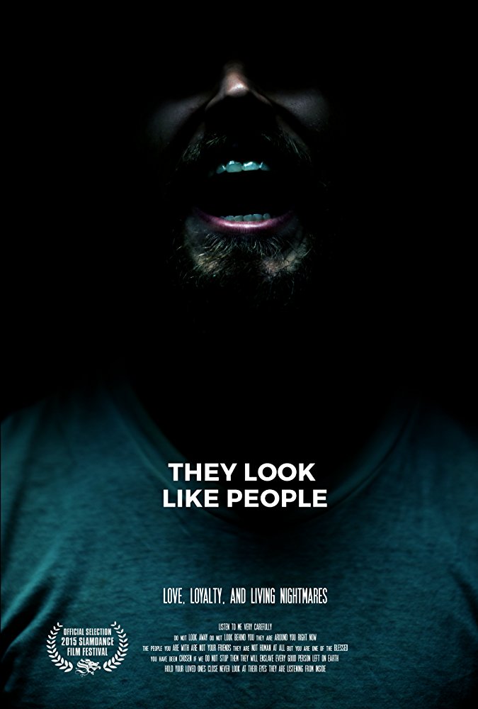
A screaming face emerging from the darkness. We don’t know if this is a scream of pain, sorrow, anger, or relief. The only thing we have a sure sense of is the utter insanity of the situation this man is in. It’s a perfect representation of the film; a man on the verge of complete madness and struggling between his thoughts of the inevitable destruction of humanity and the reality of his mental illness. We don’t know what this scream is for, but we know it’s incredibly painful — physically, mentally, and emotionally.
The VVitch (2015)
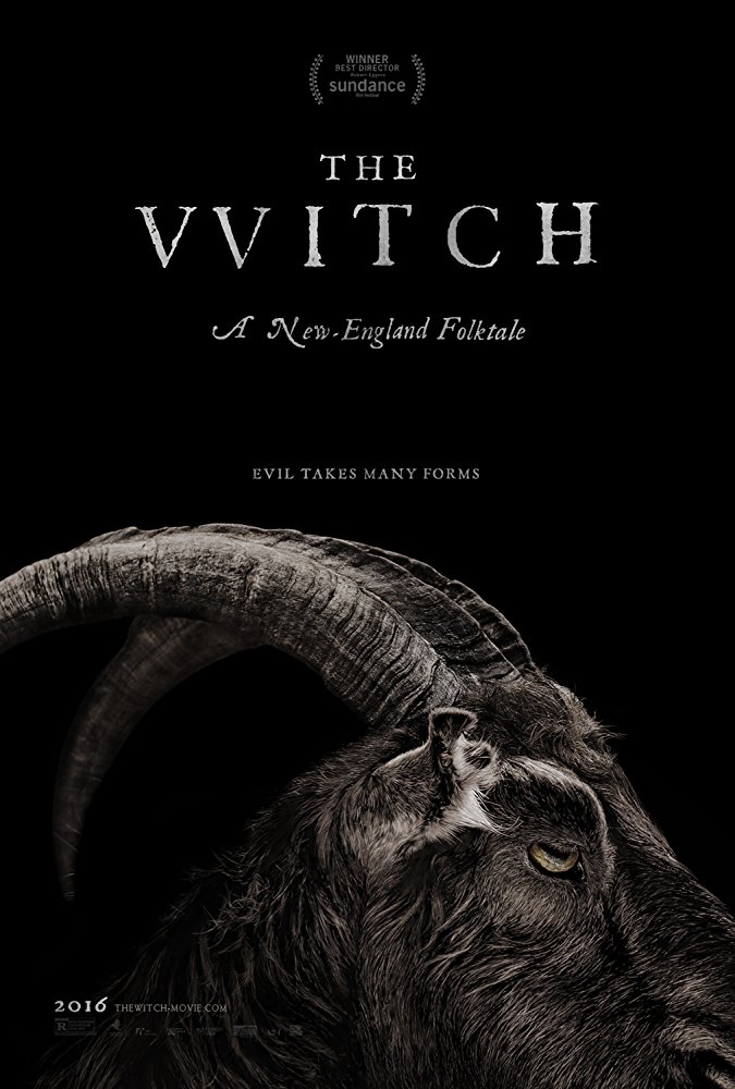
The VVitch, “a New-England Folktale,” is exactly that: an old-timey story about the early days of witch hunting in America. This poster doesn’t give much away about what goes on in the movie, but it does set the scene for a sort of demented fairy tale. The goat, named Black Phillip, almost looks like a drawing similar to one you’d find in a textbook or historical wood carving from the 1600s. The VVitch’s poster does a mighty good job at placing the audience in the right mental state for the movie.
Three… Extremes (2004)
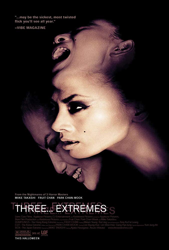
Similar to They Look Like People, the Three… Extremes poster masterfully displays the intensity about to take place in the film. Three extremely different faces that seem to show all facets of human emotion. The faces are even placed in such a way that it provides motion; the three faces move quickly between one another.
The Cabin in the Woods (2012)

The poster for The Cabin in the Woods is a brilliant example of spoiling a movie before people realize it’s a spoiler. You look at the house and think “Oh, what an odd-shaped house.” What you aren’t aware of is the level of meta this poster really is. The Cabin in the Woods is playfully showing its hand to an unsuspecting audience. It’s an obvious shout out to the movie’s underground lair of deadly nightmares. But this puzzle-box of a house the characters are struggling through won’t end happily, as there are many doors and many more monsters hiding behind them.
You’re Next (2011)
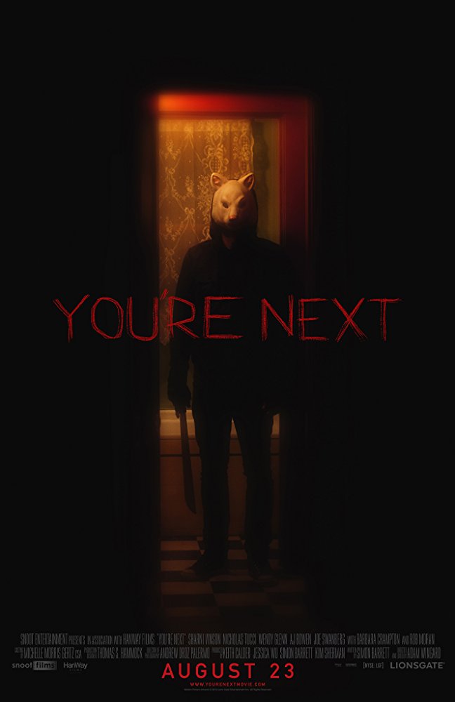
Never is a person in a mask standing in a dark doorway a good thing. This poster has the power to change anyone into a scared little kid again. Imagine lying in bed a looking up to see a bunny-man at your door. Your eyes are a bit blurry, and after a second you see this isn’t a friendly rabbit, but one holding a machete. The man in the mask is the only thing illuminated through the doorway, hinting at the isolation and feeling of no escape. Just as he’s the only thing see, you are the only thing he sees.
A Girl Walks Home Alone at Night (2011)

How can a poster be so minimalistic yet so telling of the movie to come? A Girl Walks Home Alone at Night’s poster shows the main character’s vampiric shadow pasted onto a blood-red background. The style is very reminiscent of other non-horror 60s mod films, and the movie somehow gives off that same impression. Film and poster mirror each other in every way: a lone vampire girl, a new love, a dramatic lack of color (besides black, white, and red), and even the unmistakable stare of the woman’s vampire eyes.
Noriko’s Dinner Table (2005)
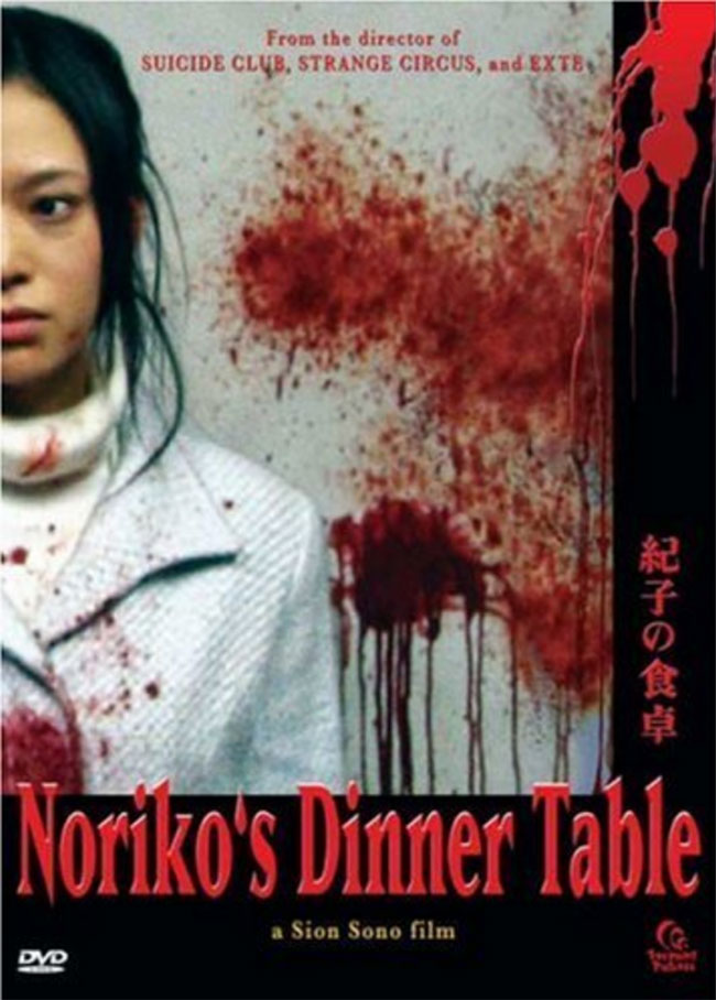
It’s all in the face with Noriko’s dinner table. There’s blood spatter everywhere, from the bare walls to Noriko’s clean white jacket. One would think that she would be terrified or disgusted, yet her expression reads as “Not this again.” It seems that no matter what trouble Noriko gets into, the outcome is always the same. You can tell she is sick of this life, but it’s her life that she must live. Has she lost hope? We don’t know, but her expression shows one of acceptance, or maybe emptiness. A poster can be a perfect place to divulge the movie’s feeling and tone, and Noriko’s Dinner Table does just that.
Cooties (2014)
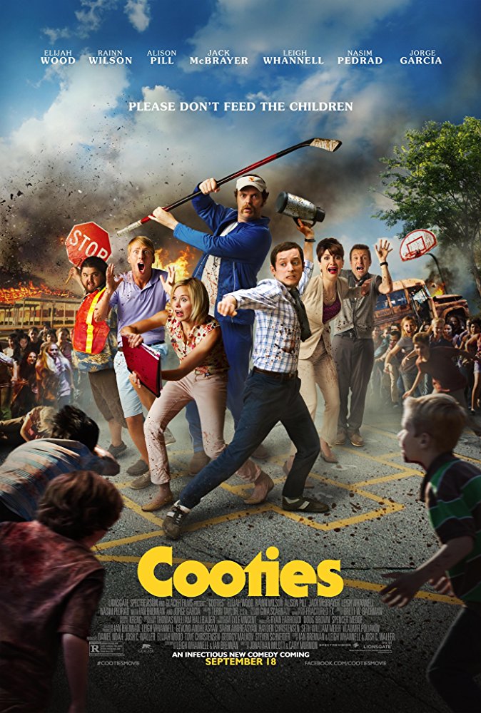
This may seem like a typical zombie movie poster, until you realize the zombies are kids. Pair this with the aggressive stances the adults are taking against the pre-teen horde, and you got yourself the perfect Zom-Com (Zombie Comedy)! There’s nothing left to the imagination here, which is actually a good thing. Zombie movies are always crowd pleasers, and the fact that the zombies are children gives Cooties a tangy zest that sets it apart from all the rest.


")
Follow Us!